Flipping Images Horizontally Or Vertically With CSS And JavaScript
In this 3 minute article we’ll look at flipping images horizontally and vertically using CSS and JavaScript. We’ll explore how to flip an img element, a background-image, or flip the actual ImageData using a canvas element.
Flipping an Image Element
We can flip the img element using the CSS transform property. We can do so using the scaleX and scaleY transforms.
Our image:
<img src="/media/tulips.jpg" alt="" />The CSS to flip it.
img {
/* flip horizontally */
transform: scaleX(-1);
}
img {
/* flip vertically */
transform: scaleY(-1);
}
img {
/* flip both */
transform: scale(-1, -1);
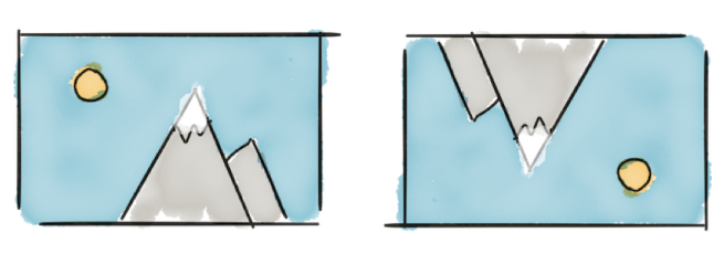
} original
scaleX(-1)
scaleY(-1)
scale(-1, -1)
original
scaleX(-1)
scaleY(-1)
scale(-1, -1)
Alternatively you can use rotateX and rotateY
img {
    /* flip horizontally */
    transform: rotateY(180deg);
}

img {
    /* flip vertically */
    transform: rotateX(180deg);
}

img {
    /* flip both */
    transform: rotateX(180deg) rotateY(180deg);
}rotateY(180deg)
The rotation transform is also a nice choice for when you want to animate the flip.
scaleX
rotateY
Note that I’ve added a slight perspective to the transform chain. Without the perspective transform the rotateY animation would be just as flat as the scaleX animation. I’ve added it to the scaleX animation as well to show that it doesn’t make a difference.
@keyframes flip-with-scale {
    0% {
        transform: perspective(400px) scaleX(1);
    }

    100% {
        transform: perspective(400px) scaleX(-1);
    }
}

@keyframes flip-with-rotate {
    0% {
        transform: perspective(400px) rotateY(0);
    }

    100% {
        transform: perspective(400px) rotateY(180deg);
    }
}
Flipping a Background Image
The only way (at this point in time) (and as far as I can tell) to flip a background-image is to flip the element containing the background image. But that would flip its contents as well.
<p class="tulips">
    Tulips form a genus of spring-blooming perennial herbaceous bulbiferous
    geophytes.
</p>
.tulips {
background-image: url(/media/tulips.jpg);
background-repeat: no-repeat;
background-size: contain;
padding-left: 5em;
}
.tulips-flipped {
transform: scaleX(-1);
}Tulips form a genus of spring-blooming perennial herbaceous bulbiferous geophytes.
originalTulips form a genus of spring-blooming perennial herbaceous bulbiferous geophytes.
scaleX(-1)Not great 🤷♂️
To work around this we can either move the background to a separate element or create a pseudo-element.
Let’s go with the pseudo-element.
.tulips {
    display: flex;
    width: 15em;
}

/* create our pseudo element */
.tulips-flipped::before {
    content: '';
    background-image: url(/media/tulips.jpg);
    background-repeat: no-repeat;
    background-size: cover;
    min-width: 5em;
}

/* flip our pseudo element */
.tulips-flipped::before {
    transform: scaleX(-1);
}
Tulips form a genus of spring-blooming perennial herbaceous bulbiferous geophytes.
originalTulips form a genus of spring-blooming perennial herbaceous bulbiferous geophytes.
scaleX(-1)Flipping an Image with JavaScript
The CSS flipping techniques only alter the presentation of an image, not the actual pixel data. We can flip the pixel data using the canvas element. This might be useful if for example we want to flip an image before it’s uploaded to a server.
We’ll use the image data in the image element below the code snippet, it’s simply an img tag with a class name set to image-tulips.
<img src="/media/tulips.jpg" class="image-tulips" alt="" />Lets get a reference to the image. That allows us to load it to a canvas element for manipulation.
const inputImage = document.querySelector('.image-tulips');

// need to check if the image has already loaded
if (inputImage.complete) {
    flipImage();
}
// if not, we wait for the onload callback to fire
else {
    inputImage.onload = flipImage;
}

// this function will flip the imagedata
function flipImage() {
    // create a canvas that will present the output image
    const outputImage = document.createElement('canvas');

    // set it to the same size as the image
    outputImage.width = inputImage.naturalWidth;
    outputImage.height = inputImage.naturalHeight;

    // get the drawing context, needed to draw the new image
    const ctx = outputImage.getContext('2d');

    // scale the drawing context negatively to the left (our image is 400 pixels wide)
    // resulting change to context: 0 to 400 -> -400 to 0
    ctx.scale(-1, 1);

    // draw our image at position [-width, 0] on the canvas, we need
    // a negative offset because of the negative scale transform
    ctx.drawImage(inputImage, -outputImage.width, 0);

    // insert the output image after the input image
    inputImage.parentNode.insertBefore(
        outputImage,
        inputImage.nextElementSibling
    );
}
The above code just ran, and you can view the result below. The first image is the inputImage and the second image is the outputImage canvas element.
Conclusion
We learned three methods to flip images for various purposes. We can flip images using the CSS transform property. The scaleX and scaleY transforms work but the rotateX and rotateY transforms allow for nicer animation (if needed). We quickly explored flipping background images using pseudo elements and ended the article with manipulating the actual image data using JavaScript and a canvas element.
Or join my newsletter
