Resize Images Proportionally While Keeping The Aspect Ratio
Sometimes images are just too big to display on the web page. We don’t need JavaScript to fix this. We can resize images proportionally with HTML image tags or CSS background styles. Let’s look at the different options we have to size images while keeping their aspect ratio in check.
Resizing HTML image tags
Our first choice is to set only one size property, either width or height, the browser will automatically calculate the size of the other edge.
Imagine we have a cat picture with an aspect ratio of 4:3, in other words, it’s dimensions are 4032 × 3024, that’s a lot of cat.
If we want it to show a bit smaller we can set the width to 240, the browser will then automatically calculate the height to be 180.
<img src="cat.jpeg" width="240" />There’s a caveat. Images aren’t immediately available.
The browser will render the page, wait for the image source to load, and then update the height of the image element. This will most likely cause the browser to render the page twice, because after the height of the image is updated all items below the image are pushed down.
This is bad news for your page performance.
Best to set the intended size so the browser can reserve space.
<img src="cat.jpeg" width="240" height="180" />But what if we don’t know the aspect ratio of the image and we get a square cat picture? Won’t our cat be squished? Yes, yes it would, poor cat.

But fear not, we can fix this with CSS.
img {
    object-fit: contain;
}
Pass cover instead of contain to tell the browser to fill the entire image tag with cat pixels.
img {
    object-fit: cover;
}
What if our image needs to be limited to the width of a parent element? In that situation we can use CSS max-width or width to fit the image.
Use max-width: 100% to limit the size but allow smaller image sizes, use width: 100% to always scale the image to fit the parent container width.
<div>
    <img src="cat.jpeg" width="240" height="180" />
</div>
div {
width: 240px;
border: 1px solid pink;
}
img {
max-width: 100%;
object-fit: contain;
}
We can further use CSS to fix the aspect ratio of the image, learn more about presenting images in a specific aspect ratio.
Resizing CSS background images
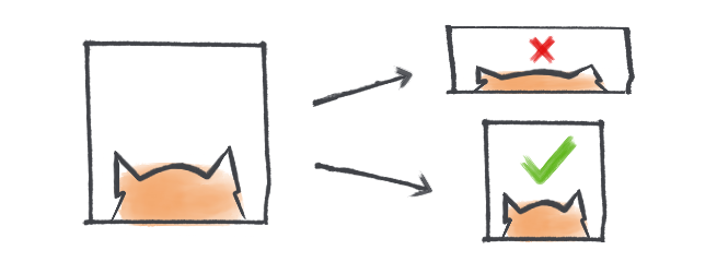
By default a background-image will be repeated over the background of an element if it’s smaller, if it’s bigger it won’t be scaled but parts of the image won’t be visible. In the example below, the bottom and right part of our cat aren’t rendered.
<div style="width:200px; height:200px;"></div>div {
background: url('cat.jpeg') no-repeat;
border: 1px solid pink;
}We can fix this by setting the background-size property. To fit the image inside the element we use the contain value. The browser will fit the image inside the element bounds and scale it proportionally.
<div style="width:200px; height:200px;"></div>div {
background: url('cat.jpeg') no-repeat;
background-size: contain; /* scales the image */
background-position: center; /* centers the image */
border: 1px solid pink;
}Similar to object-fit we can also use the cover value to tell the browser to cover the element with cat pixels. As you can see below, this will cause it to scale down just enough to fit the vertical space, now only the right side of our cat is cropped.
<div style="width:200px; height:200px;"></div>div {
background: url('cat.jpeg') no-repeat;
background-size: cover;
border: 1px solid pink;
}We can also supply a singular width value to the background-size property. Similar to the img element, the height will be automatically calculated.
<div style="width:200px; height:200px;"></div>div {
background: url('cat.jpeg') no-repeat;
background-size: 200px;
border: 1px solid pink;
}That’s it!
Or join my newsletter
