Styling Password Fields To Get Better Dots
Make the dots in a password field bigger with this basic CSS style. It’ll make it easier to see the number of dots in the field, helping both yourself and the visually impaired.
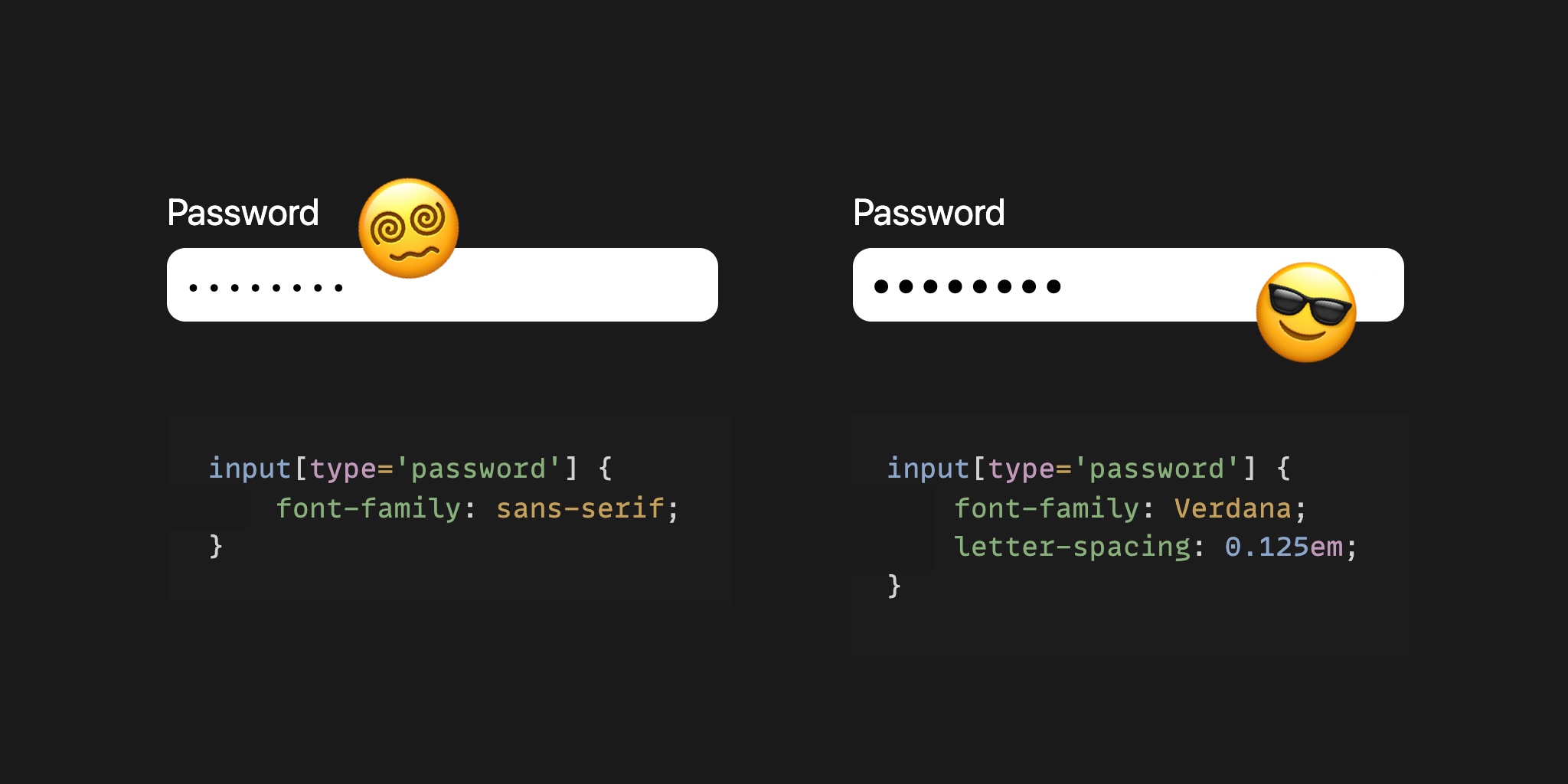
Depending the font used the dots in the password field look like this. The font-family on the field below is set to sans-serif
We can use the Verdana font to scale the dots to a more comfortable size.
input[type='password'] {
    font-family: Verdana;
}
That’s better already, now let’s separate the individual dots.
input[type='password'] {
    font-family: Verdana;
    letter-spacing: 0.125em;
}
Much better. It’s now a lot easier to see the individual dots, and the dots nicely take up space in the field.
This works on Mac Firefox / Mac Chrome / Mac Safari / Win Chrome (+Edge). Android doesn’t have Verdana so shows dots that are a bit smaller.
Or join my newsletter
