Fix Google Search Console Mobile Usability Issues With A CSS Snippet
Every other week Google Search Console will send me an email reporting Mobile Usability issues on this blog. I’ll log in, click “Validate Fix”, and find that everything is just peachy. What’s going on? More importantly, how do we fix this?
Usually Google Search Console reports one or all of the following issues:
- Clickable elements too close together
- Text too small to read
- Content wider than screen
The pages it finds these issues on are seemingly random.
What’s causing this?
The origin of the issue is two-fold:
- Sometimes the Googlebot is in a hurry and will not fetch all page resources when it loads your page for indexing.
- One or several HTML elements on the page are wider than the mobile viewport but only so when your CSS fails to load.
Things go haywire when Googlebot skips your CSS file on a page where some content forces the viewport to scale or scroll if it doesn’t receive a CSS style.
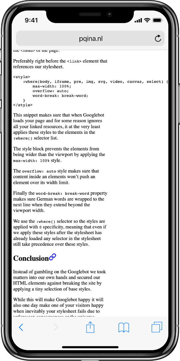
This could for example be an <img> or <video> tag without a width attribute, or a code snippet with long lines in a <pre> (as seen in the image below).

Another culprit can be the content itself. Super long German words like Rechtsschutzversicherungsgesellschaften won’t automagically wrap to the next line.
How to fix it?
We can press “Validate Fix” and that’ll fix it the day after, but that gets old fast. Instead we need a more permanent solution.
The fix is a small set of CSS styles. We can add the following code snippet to the <head> of the page.
Preferably right before the <link> element that references our stylesheet.
<style>
    :where(body, iframe, pre, img, svg, video, canvas, select) {
        max-width: 100%;
        overflow: auto;
        word-break: break-word;
    }
</style>
This snippet makes sure that when Googlebot ignores your page resources, it at least applies these styles to the elements in the :where() selector list.
max-width: 100%prevents the elements from being wider than the viewport.overflow: automakes sure that content inside an element won’t push an element over its width limit.word-break: break-wordmakes sure long words are wrapped to the next line when they extend beyond the viewport width.
We use the :where() selector so the styles are applied with 0 specificity. This means that we will be able to overwrite these styles in our stylesheet without having to make our selectors extra specific.
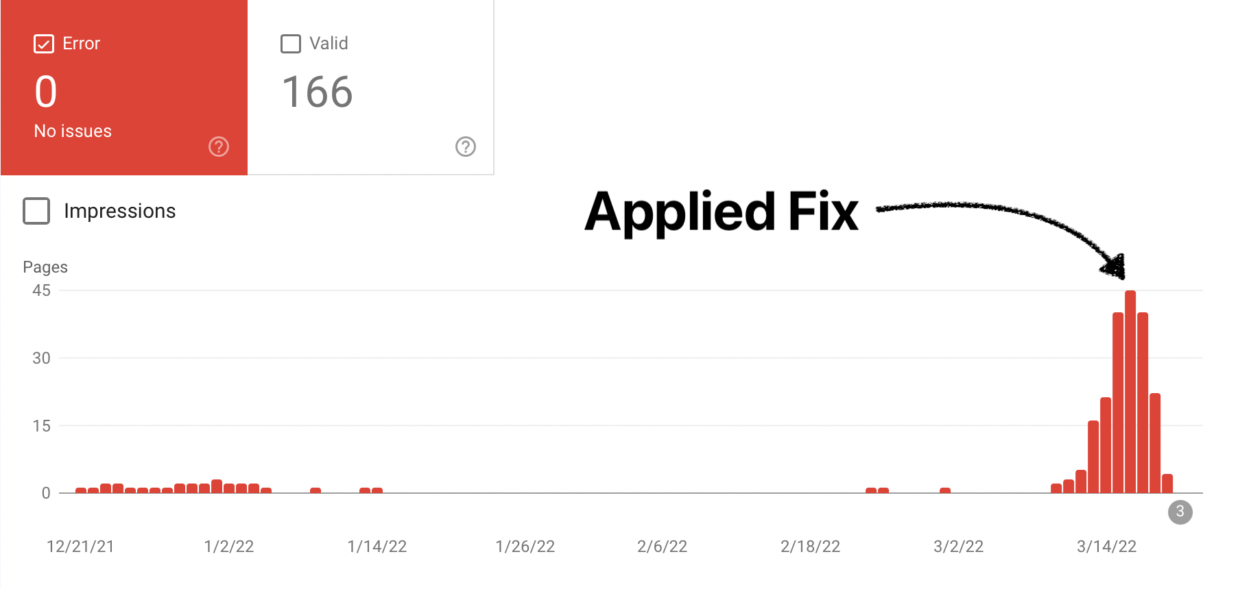
After copying the snippet to your page, ask Google Search Console, for one final time, to “Validate The Fix”, the issues should go away over the next few days and will only return if you make an actual mistake in your stylesheet.

Conclusion
Instead of gambling on the Googlebot we took matters into our own hands and secured our HTML elements against breaking the site by applying a tiny set of base styles.
While this will make Googlebot happy it will also one day make one of your visitors happy when inevitably your stylesheet fails due to unforeseen consequences or the universe aligning in a weird way.
Instead of rolling with our eyes we can now trust something is wrong when Google Search Console sends us a Mobile Usability issue report.